JMultiButton
How to group actions in a single button using Java Swing
Often in applications there are actions which can be grouped under a common theme. For primary and secondary actions this is usually solved using “split buttons”, i.e. buttons which have a primary action and show an arrow which shows a context menu with the secondary actions. However, if there are only actions which are considered primary this would not b a good design. For instance, think of a tool where you move through datasets using navigational buttons (first, previous, next, last). These four actions could be realized by four individual buttons placed next to each other among other buttons:
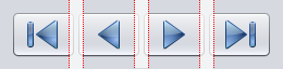
 From a user’s perspective, there is no visual indication that these four actions are part of a group (apart from using similar icons and being placed next to each other). This becomes even less evident as there is no clear separation to the other actions. What we want to accomplish is some kind of a combined button which looks like multiple buttons in one:

Let’s see how this can accomplished for Java Swing:
One important aspect of the end result has to be that these four buttons still have to act like four separate buttons to the user. This is especially true for keyboard control, focus behavior and so on. Due to this we will build the implementation around a number of custom buttons and not extend JButton to have multiple action areas.
The proposed solution is to visually remove the inner edges of the buttons and stick them together, so that they look as if they are parts of a single button.
 The actual outcome depends on the used Look&Feel (LaF) of the swing application. As a sample we use the Nimbus LaF.
Fortunately, in Java Swing we can override the paintComponent method to customize the appearance of any control. Consequently, in order to remove the edges of a button in this group we have to know its position relative to the other buttons. As there are three positions relevant to drawing (the first button, center buttons, the last button) an enum seems fitting here:
The actual outcome depends on the used Look&Feel (LaF) of the swing application. As a sample we use the Nimbus LaF.
Fortunately, in Java Swing we can override the paintComponent method to customize the appearance of any control. Consequently, in order to remove the edges of a button in this group we have to know its position relative to the other buttons. As there are three positions relevant to drawing (the first button, center buttons, the last button) an enum seems fitting here:
public enum PartButtonPosition {
    LEADING,
    MIDDLE,
    TRAILING;

    public static PartButtonPosition fromIndex(int index, int count) {
        if (index <= 0)
            return PartButtonPosition.LEADING;
        if (index >= count -1)
            return PartButtonPosition.TRAILING;

        return PartButtonPosition.MIDDLE;
    }
}
Therefore, we base our custom control - JMultiButton - on JPanel which will host our custom-drawn buttons (PartButton).
public class JMultiButton extends JPanel {

    JButton[] buttons;

    public JMultiButton(int buttonCount) {
        initComponents(buttonCount);
    }

    public int getButtonCount() {
        return buttons.length;
    }

    public JButton getButton(int index) {
        return buttons[index];
    }

    private void initComponents(int buttonCount) {
        setLayout(new FlowLayout(FlowLayout.LEFT, 0, 0));

        buttons = new JButton[buttonCount];
        for(int i = 0; i < buttonCount; i++) {
            buttons[i] = new PartButton(PartButtonPosition.fromIndex(i, buttonCount));
            this.add(buttons[i], null);
        }
    }
}
As you can see, upon creating a JMultiButton, you pass it the amount of sub buttons it will consist of which will then be created internally and aligned using a gapless flow layout. Afterwards each button can be retrieved using the getButton(idx) method and customized like any normal JButton (e.g. setting text, icon, ActionListener). When drawing these sub buttons we just have to make sure that the edges are cropped depending on the position of the sub button. Essentially, this is what the PartButton class does. It is derived from JButton and overrides its paintComponent method to crop the edges as shown in the image before. Since we want to keep the look (and as such the visual behavior for the user) of the original button we have to call JButton’s paintComponent in a way that we can cut off the edges later. The idea is to render it to a buffer and then copy it to our PartButton’s painting surface without one or both edges. Naturally, the original button will always be rendered to fit its size, i.e. width and height, including edges. If we then remove the edges we end up with an image which is too narrow for our painting space. To easily fix this, we override PartButton’s getWidth() method to return a larger width during painting. Consequently, we have to create an image buffer of this side on which we let JButton’s paintComponent method draw. Subsequently we can cut out the appropriate region of the button and copy it to the actual Graphics target of the component.
 private static class PartButton extends JButton {

        boolean isPainting = false;
        private PartButtonPosition position;
        BufferedImage buf;

        int cutOffSize = 6;
        int sepYOffset = 6;

        public PartButton(PartButtonPosition position) {
            this.position = position;
        }

        private BufferedImage getBuffer() {
            if (buf == null || buf.getWidth() != getWidth() || buf.getHeight() != getHeight()) {
                buf = new BufferedImage(getWidth(), getHeight(), BufferedImage.TYPE_INT_ARGB);
            }

            return buf;
        }

        @Override
        public int getWidth() {
            if (isPainting) {
                switch (position) {
                    case MIDDLE:
                        return super.getWidth() + 2*cutOffSize;
                    case LEADING:
                    case TRAILING:
                        return super.getWidth() + cutOffSize;
                }
            }

            return super.getWidth();
        }

        @Override
        protected void paintComponent(Graphics g) {
            Graphics2D bg = null;
            try {
                isPainting = true;
                BufferedImage buf = getBuffer();
                bg = buf.createGraphics();
                bg.setBackground(getBackground());
                bg.clearRect(0, 0, buf.getWidth(), buf.getHeight());
                super.paintComponent(bg);

                int drawOffset = 0;
                bg.setColor(Color.black);
                bg.setStroke(new BasicStroke(1,
                        BasicStroke.CAP_SQUARE,
                        BasicStroke.JOIN_MITER,
                        10.0f,
                        new float[] {1.0f,2.0f},
                        0.0f));

                switch (position) {
                    case LEADING:
                        break;
                    case MIDDLE:
                        drawOffset = -cutOffSize;
                        bg.drawLine( cutOffSize, sepYOffset, cutOffSize, buf.getHeight() - sepYOffset);
                        break;
                    case TRAILING:
                        drawOffset = -cutOffSize;
                        bg.drawLine( cutOffSize, sepYOffset, cutOffSize, buf.getHeight() - sepYOffset);
                        break;
                }

                g.drawImage(buf, drawOffset, 0, null);
            } finally {
                isPainting = false;
                if (bg != null) {
                    bg.dispose();
                }
            }
        }
    }
In this given code I have introduced a dashed line between adjacent PartButtons to make it more clear to the user, that these are in fact different actions.
A JMultiButton component with four sub buttons could then be constructed like this:
JMultiButton btn = new JMultiButton(4);
btn.getButton(0).setIcon(new ImageIcon([icon]));
btn.getButton(1).setIcon(new ImageIcon([icon]));
btn.getButton(2).setIcon(new ImageIcon([icon]));
btn.getButton(3).setIcon(new ImageIcon([icon]));
This is how the component then looks in motion: