
Automatically grayscale images on disabled WPF buttons
Let’s create buttons with icons which are appealing for the eye even when they’re disabled
When creating WPF applications a recurring task is binding your ViewModel commands to buttons. WPF then nicely ensures that the button’s state represents the canExecute value of the command, i.e. the button gets automatically disabled when the command cannot be executed and enabled when it is executable again. Usually, when designing user interfaces images and icons play an important role and in WPF it is really easy to add images to buttons since we can freely design its content. So, to have the button display an icon we just drop an Image control and (probably) an accompanying TextBlock into the button’s Content property:
<Button Command="{Binding TestCommand}">
    <Grid Margin="5 2">
        <Grid.RowDefinitions>
            <RowDefinition Height="Auto" />
            <RowDefinition Height="*" />
        </Grid.RowDefinitions>
        <Image Source="Images/folder.png" Stretch="None" HorizontalAlignment="Center" />
        <TextBlock Grid.Row="1" Text="Browse for folder" HorizontalAlignment="Center" />
    </Grid>
</Button>
But now, when the button gets disabled it looks rather odd:
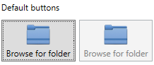
While the button is grayed out the image still looks normal. The user expectancy here would be that the image also gets a disabled look, i.e. it gets grayed out. However, behind the scenes the button passes the value of its IsEnabled property to its child controls. That is the reason why the TextBlock gets grayed out. So in order for our button icon to be automatically be grayed out, we have to create an Image control which changes its appearance based on the IsEnabled property. The first solution which may come to mind is to create a ValueConverter for the Image’s Source property which selects the image or a grayscaled version of it depending on the IsEnabled property. The main drawback here is that we would then need to create a grayscaled version of every image we want to use in a button which is not very comfortable from a developer standpoint. A better solution would be to have WPF do the heavy lifting and grayscale the image for us. This can be done rather easily by using the FormatConvertedBitmap class. By supplying a target PixelFormat of PixelFormats.Gray8 we easily get a grayscale version of our image. We then just have to update the Control’s image everytime the IsEnabled or Source (e.g. when the image is replaced by a new one) are updated. Thus, we end up with the following Image control:
 class AutoDisableImage : Image
{
    protected bool IsGrayscaled => Source is FormatConvertedBitmap;

    /// <summary>
    /// Initializes a new instance of the <see cref="AutoDisableImage"/> class.
    /// </summary>
    static AutoDisableImage()
    {
        // Override the metadata of the IsEnabled and Source properties to be notified of changes
        IsEnabledProperty.OverrideMetadata(typeof(AutoDisableImage), new FrameworkPropertyMetadata(true, new PropertyChangedCallback(OnAutoDisableImagePropertyChanged)));
        SourceProperty.OverrideMetadata(typeof(AutoDisableImage), new FrameworkPropertyMetadata(null, new PropertyChangedCallback(OnAutoDisableImagePropertyChanged)));
    }

    /// <summary>
    /// Called when AutoDisableImage's IsEnabled or Source property values changed
    /// </summary>
    /// <param name="source">The source.</param>
    /// <param name="args">The <see cref="System.Windows.DependencyPropertyChangedEventArgs"/> instance containing the event data.</param>
    private static void OnAutoDisableImagePropertyChanged(DependencyObject source, DependencyPropertyChangedEventArgs args)
    {
        if (source is AutoDisableImage me && me.IsEnabled == me.IsGrayscaled)
        {
            me.UpdateImage();
        }
    }

    protected void UpdateImage()
    {
        if (Source == null) return;

        if (IsEnabled)
        {
            // image is enabled (i.e. use the original image)

            if (IsGrayscaled)
            {
                // restore the original image
                Source = ((FormatConvertedBitmap)Source).Source;
                // reset the Opcity Mask
                OpacityMask = null;
            }
        }
        else
        {
            // image is disabled (i.e. grayscale the original image)
            if (!IsGrayscaled)
            {
                // Get the source bitmap
                if (Source is BitmapSource bitmapImage)
                {
                    Source = new FormatConvertedBitmap(bitmapImage, PixelFormats.Gray8, null, 0);
                    // reuse the opacity mask from the original image as FormatConvertedBitmap does not keep transparency info
                    OpacityMask = new ImageBrush(bitmapImage);
                }
            }
        }
    }
}
We can now use the AutoDisableImage as a drop-in replacement for the Image controls in our buttons:
<Button Command="{Binding TestCommand}">
    <Grid Margin="5 2">
        <Grid.RowDefinitions>
            <RowDefinition Height="Auto" />
            <RowDefinition Height="*" />
        </Grid.RowDefinitions>
        <local:AutoDisableImage Source="Images/folder.png" Stretch="None" HorizontalAlignment="Center" />
        <TextBlock Grid.Row="1" Text="Browse for folder" HorizontalAlignment="Center" />
    </Grid>
</Button>
which results in the following:
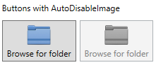
Perfect, this is what we wanted. However, I would recommend to encapsulate all the button content code in a separate UserControl, say IconButton for ease of use. So that you then can use it like this:
<controls:IconButton Command="{Binding TestCommand}" Text="Browse for folder" ImageSource="Images/folder.png" />
If you want a less satured look of the image once it’s disabled, an easy way to achieve this is to just set its Opacity to a lower value (e.g. 0.25).